• Follow me on:

Monday, December 10, 2012

CSS3 Box Shadow

With CSS3 coming into play web designing is getting better and saving lot of time for designers, now there is no need of making transparent images for shadow effects, just a simple CSS and u can get a nice shadow effect to ur block elements.
Here's the CSS syntax for any block level elements like Div, Image etc.

Box-Shadow

.boxDiv {
  -moz-box-shadow:    3px 3px 5px 6px #ccc;
  -webkit-box-shadow: 3px 3px 5px 6px #ccc;
  box-shadow:         3px 3px 5px 6px #ccc;
}

Inner shadow

.box {
   -moz-box-shadow:    inset 0 0 10px #000000;
   -webkit-box-shadow: inset 0 0 10px #000000;
   box-shadow:         inset 0 0 10px #000000;
}

One-sided shadow

.box {
    -webkit-box-shadow: 0 8px 6px -6px black;
    -moz-box-shadow: 0 8px 6px -6px black;
     box-shadow: 0 8px 6px -6px black;
}


Now lets discuss the values used in the syntax:

box-shadow: h-shadow v-shadow blur spread color inset;

h-shadow is the horizontal offset of the shadow, both positive and negative can be used positive value means the shadow will be on the right side of the box and a negative value will show the shadow on the left side of the box.

v-shadow is the vertical offset of the shadow, it also accepts both positive and negative values, here positive values put the shadow below the box and negative value means shadow above the box.

blur is the blur radius its optional, if the value is 0 the shadow will be sharp. Higher value means more blurred shadow.

spread is the spread radius of the shadow in simple words we can say it is size of the shadow, this one is also optional, default value is 0 the shadow is same size as blur, positive value increase the  size of the shadow and negative value decreases.

color is the color of the shadow u want, obviously its better to use dark colors for the shadow.

There is another value which you can see above in the syntax. Its inset this one is also Optional value but this can change the shadow from an outer shadow (outset) to an inner shadow.

I hope this much description was enough for you, its great to have this shadow effects in your websites. 

Share Your Solutions

Thursday, November 15, 2012

Custom Select Box using CSS only

I hope you read my last blog, custom select box using jquery and css.  If you haven't  then no need to worry, here I am with a better solution to the same problem.  Customising a select box using jquery and CSS was conflicting with other jquery and javascript codes.  In a single page with jquery dedicated to select box only was working well.  But when I used it in a project it wasn't.  So a little bit of more effort and here's the solution, select box customised using CSS only and with CSS no need to worry about the conflicts and all.

Here's the HTML for the select box:
<div class="styled-select">
   <select>
      <option>Select One</option>
      <option>Blue</option>
      <option>Red</option>
      <option>Green</option>
      <option>Yellow</option>
      <option>Brown</option>
   </select>
</div>


Here's the CSS for the select box:
.styled-select select {
   background: transparent;
   width: 166px;
   padding: 3px 0px 4px 9px;
   font-size: 11px;
   border: none;
   height: 25px;
   color:#efefef;
}

.styled-select {
   width: 144px;
   height: 25px;
   overflow: hidden;
   background: url(selectBG.png) no-repeat;
   border:none;
}


     You can see the HTML, the select box is placed in a div with a class name "style-select".  That  div is styled with a background image selectBG.png.  The image width is 144px where as the select box is with a width of 166px.   The width of the container div i.e. styled-select should be less than the width of the select box, this way you can hide the drop down arrow of the select box which is impossible to style whereas rest of the select box can be easily styled.  Following is the screen shot of the combo box.

Share Your Solutions

Monday, November 12, 2012

Custom Select Box, using CSS and Jquery

It was July when I posted my last blog.  Was fullllllll busy with work and festivals.   Few days back I was preparing a HTML for a design provided by a client.  And the design was containing a select box with mastttt design.   So styling a select box is not possible with normal CSS.  You can style everything with the CSS except that right arrow.  So, google was the only hope and as usual I found the solution.  So, thought of sharing with you all.

HTML for the select box

<select class="select" title="Select one">
                <option></option>
                <option>Blue</option>
                <option>Red</option>
                <option>Green</option>
                <option>Yellow</option>
                <option>Brown</option>
</select>

CSS for the select box

/* setting the width and height of the SELECT element to match the replacing graphics */
select.select{
        position:relative;
        z-index:10;
        width:166px !important;
        height:26px !important;
        line-height:26px;
}

/* dynamically created SPAN, placed below the SELECT */
span.select{
    position:absolute;
    bottom:0;
    float:left;
    left:0;
    width:166px;
    height:26px;
    line-height:26px;
    text-indent:10px;
    background:url(selectBG.gif) no-repeat 0 0;
    cursor:default;
    z-index:1;
    }


you must make an image of size 166px X 26px.  The size of the select box and the background image which you are going to place as the select box should be same.  You can see the CSS for span.select{...}, I have used a background image selectBG.gif.

      Finally, the javascript you should use to make your customized select box. Use the following javascript and don't forget to include latest jquery file.

<script type="text/javascript">
    $(document).ready(function(){   

        if (!$.browser.opera) {   
            // select element styling
            $('select.select').each(function(){
               var title = $(this).attr('title');
                if( $('option:selected', this).val() != ''  ) title = $('option:selected',this).text();
                $(this)
                    .css({'z-index':10,'opacity':0,'-khtml-appearance':'none'})
                    .after('<span class="select">' + title + '</span>')
                    .change(function(){
                        val = $('option:selected',this).text();
                        $(this).next().text(val);
                        })
            });
        };       
    });
</script>


Following is the screen shot of the select box.  The black rounded select box in the screen shot is selectBG.gif which I used in the background of the select element.

I hope it is going to help you!! Byeeeeeeeeeeee and and dont forget to......

Share Your Solutions


Saturday, July 7, 2012

Rasmancha Vector

Last weekend i had a trip to Bishnupur, there was this Rasmancha the architecture of this temple is a combination of three different architectures.

Image Courtesy Venkat Sridhar
 
 I tried to copy the architecture in my way.  Here it is the vector of Rasmancha, Bishnupur

FYI a little about Rasmancha, Bishnupur copied from WIKI, GOOGLE....................

This amazing spepcimen of architecture was established by the Malla King Birhamvir in the year 1587.  This pavilion was used for housing of Idols of Krishna from other temples during the Rash Festival.  It consists of a small square central shrine enclosed by three gallerires and provided with an emposing pyramidial roofs.  There are ten openings on eac side of its outer most corridor which are elegantly surrounded by Bengal roof structures.  This large architecture proclaims the glory of Malla Dynasty to the Tourists in Bishnupur.


Tuesday, July 3, 2012

Bishnupur - Town of Terracotta

A small town which i m sure many of you havent heard about this, its just 97 kilometres from kharagpur.  Best way to reach bishnupur is Rupasi Bangla Express which departs around 0600 hours at Kolkata and reach around 1000 hours.  I heard a lot about this town about the famous Baluchuri saree about those terracota temple. Trip to bishnupur came out to be a complete bundle of surprise.  Main attraction of Bishnupur is Terracotta temples, all these temples are dedicated to lord Krishna and Radha.  one s is not enough to describe the pluralness of this town it should be templessssssssssss.....many terracotta temples are spread across the town peeping out of every corner of town.  Many temples were like place of ADDA for the adults.

(Thanks to the ticket examiner Bamdev Dutta Da at ShaymRai Temple, he told us everything he know about this town) 
Bishnupur was the capital of Malla kings of Mallabhum, or the warrior kings, which was an important dynasty that ruled Bengal for a long time with its beginnings in late 7th century that lasted till early 19th century.  This is more than 1100 years and 55 generations. Most temples belong to the 17-18th century. It is said that the dynasty was originally a Shaivik i.e. they used to follow the lord Shiva but king Bir Hambir who ruled in 16th century converted to Vaishnava (who follow Lord Vishnu) and that lead to construction of all these temples dedicated to incarnations of Vishnu and most prominently Krishna.

These temples are not carved out of stones or something, these were constructed from the clay that is locally available.  All these temples are made of bricks and were decorated with terracotta work tiles.  From Bishnupur station you can hire a cab or a cycle rickshaw to visit all the temples of bishnupur.  It would be better to hire a cab you can save lot of time.  The cab will cost you around 400 to 500 rupees.  It depends on the cab driver which direction he is going to show you the town.

We started from Rasmancha which is towards east, one has to buy tickets there for entrance to Rasmancha, Jorbangla and Shyamrai temple. Rasmancha is a unique structure combination of 3 architecture in a single building.  Pyramid roof, then typical indian Bengal Roof structure - do chal char chal roof and the corridor architecture is very much mughal style.  Main purpose of this Rasmancha was for housing idols of Krishna from all other temples during the Rash Utsav.

Ras Mancha Temple
 Madan Mohan temple, built by Malla King Durjan Singha in the AD 1694
Madan Mohan Temple
Shaym Rai Temple, built by Raghunath singha in 1643 AD.  Five shikhara temple.  The terracotta art on the body of the temple expresses the activity of God Krishna and the Rash Utsav.  Even the architecture of Dakshineswar kali mandir is also inspired from this temple only.
Shyam Rai Temple

Rash Utsav expressed on the wall of Shyam Rai temple
Radha Laljiu temple, built by Bir Singha 1658 AD, is one of the best examples in laterite of this type with a single sikhara on a curved bangla chala roof.

Radha Laljiu Temple, Image courtesy Jaydharclix
Main Gateway of Bishnupur also known as Pathar Darwaja is built by dressed laterite blocks.  This was the northern entrance to the royal residence, and was built by Maharaja Bir Singha.  There are narrow slits for the archer and gunman.
Main Gateway of Bishnupur, Photography Venkat Sridhar
 Radha Shayam temple, built by chaitanya singh in 1758 AD

Radha Shyam Temple, Photography Venkat Sridhar
 Jor Bangla Temple, built by Raghunath singha in 1655 AD,  also known as Krishna Rai Temple.

Jor Bangla Temple, Photography Venkat Sridhar
Just opposite to Radha shyam temple, there is a temple one should say oldest temple in Bishnupur.  People say that Maharaja Jagat Malla established this temple and the image of the goddesss Mrinmoyee in 997 AD after getting diving command from the Goddess.  The statue of the goddess is made up of Ganga Mati (mud from ganga river)  One can see abandoned royal residence adjacent to the temple.  And all these Radha Laljiu, Jorbangla, gateway are in the same cluster.
      There is another temple Chinnamasta temple of goddess kali.  Chinnamasta means beheaded, the statue of goddess is beheaded. photography is prohibited at both the mrinmoyee and chinnamasta temple.  Near the Chinnamasta temple you can see Dalmadal cannon was used by Malla King Gopal Singh to defend himself against the Maratha commander Bhaskar Rao in 1742 AD.  But people say that the Lord Krishna himself came as a boy of 18 years  and used this cannon to protect Malla Dynasty.

Dal Madal Cannon, Photography Venkat Sridhar

Terracotta handicrafts for sale, Image courtesy Jaydharclix

Terracotta handicrafts for sale, Image courtesy Jaydharclix
 There are few other places like LalBandh, LalGarh,  GumGarh which you can visit.  It will take 3 to 4 hours to visit all the places.  You can buy terracotta handicraft items near Madan Mohan temple and chinna masta temple.  The handicrafts are sold at fixed price but very reasonable.  One more thing for which Bishnupur is famous is Baluchuri saree.  If you travel in town you can find many shops and showrooms of Baluchuri sarees. While coming back i saw few on LalBandh road.

The terracotta temples have made Bishnupur a remarkable place in the history of Bengal as well as of India.


 Image Courtesy By Venkat Sridhar

Friday, June 29, 2012

Ahhhh its been long time...

I was searching for some papers on my beautifully chaosed bed, right then i saw my brushes and color palettes below my bed.  i asked myself and after a while i realized that i wasn’t after painting anything from long time, i was abusing my brushes, i had a very straight answer.......han be barso beet gye unko hath lgaye (yes u a** **** its been long time u have touched them). After a little more thought i decided to paint something.  I took out my album and ended with a image of a lady whom i clicked long back in 2005 in GOA, she was selling flowers and coconut near Shanta Durga temple. I am not a trained or professional  painter to use fabric colors or oil paints.  From school days I have been using water colors only.


And this was something I ended up with!!

Tuesday, June 19, 2012

Logo ideas for NGO's

There are many factors we have to consider while designing a logo. The company's target audience is high on the list. There are many features of a logo design like abstraction, font type, colors and illustration. Abstract logo designs are good and always been my favourite, a designer can always show their creativity through abstract logos only, but highly abstract logos are not suitable for business. Viewers may not associate your company with your services if the logo is too abstract. Simple, abstract logos are attractive and they promote your business' attributes and style.

An abstract logo has to be simple, yet complicated. Simplicity of an abstract logo design makes a logo easy to reproduce and its complicated aspect makes it easy for customers to recognize. Use limited colors in your NGO logos, avoid muddy colors and consider contrasts when thinking of designing a logo. 

    Generally all companies have same problems, they have to consider how they are perceived by their clients, their customers and their competitors.  But this is not at all a problem for NGO's they just want the logo to represent their thinking and cause. Sometimes client can ask you to show a complete scenario of their NGO in a single image, here comes the challenge.  Use blue, green, yellow colors for the logos as these colors represents care and help.  If the NGO is some kind of revolutionary organization then you can try orange, red and black.  But the final decision of the colors is going to be decided by the client only.  These theoretical color combinations for different logos are useless without approval of client.  So its client who is going to decide color of your logos.

Last month i got an oppurtunity to design logos for an NGO, actually two NGO's.   Following are the ideas I
came up with. Planting trees and education of underprivileged students is the motive of that NGO.
Share your solutions

Monday, June 11, 2012

How to scale contents of a file when you resize the stage in flash cs5.5?

With loads of devices coming into the market with different display sizes,  it becomes important for  designers to keep their designs flexible and compatible with all screen sizes.  Its ok with the css using percentage you can make your websites
flexible and compatible for all screen sizes but what about the flash files.  You need different .swf sizes for different screen sizes.  So you need to resize the .fla file and save it in different sizes as per your requirement.   Scaling the complete document of flash file with the stage is the only solution. 
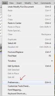
Following are the steps to scale contents of a file when you resize the stage in flash cs5.5

Open the document which you want to resize

Go to Edit -- Preferences (Ctrl + U)


Preferences window will open
Check the options Align top left and Include locked and hidden layers under Scale Content, the options are at last in that preferences window


Then go to the properties window click on the spanner icon in the properties window near the size,  document settings window will open.


Enter the dimensions width and height and don't forget to check the option "Scale content with stage" then click on OK and your done.


Your file is resized.

Share your solutions

Monday, May 28, 2012

Multiple backgrounds with CSS


Using images in the background is always a better option to make your website look attractive.  Now most of the web browsers are supporting multiple backgrounds. Now we can have multiple background images to a DIV or any box elements.  Suppose there is a div with id divId

#divId{
width: 500px;
height: 250px;
background-image: url(girl.png), url(boardskygrass.png);
background-position: center bottom, left top;
background-repeat: no-repeat;
}


In the above example

two images are used sheep.png and boardskygrass.png


A comma-separated list of values for the background-image property, with each value generating a separate ‘background layer’.  The comma separated lists from the individual background images are then matched up, starting with the first value in each list.
     In the same way we can also use a comma separated list for the other background properties; like background-repeat, background-attachment, background-position, background-clip, background-origin and background-size.

If excess values are provided for any of the above properties they are ignored. e.g. if four values are supplied for the background-repeat property, but only three values are supplied for the background-image property, the fourth value in the list would not be used.
In the same way if not enough values are supplied for any of the individual properties, the list of values for that particular property are repeated, from the first value, as many times as required. For example; if only two values are supplied for the background-position property, but three values are supplied for the background-image property, the list of values for background-position would be repeated, thus the third background image specified would have the same background-position value as the first, as the first value is considered for all the background images.


Browser Compatibility

Browser support for multiple backgrounds is relatively widespread with all of the main browsers offering support, without the need for vendor prefixes.

Firefox has supported multiple backgrounds since version 3.6 (Gecko 1.9.2), Safari since version 1.3, Chrome since version 10, Opera since version 10.50 (Presto 2.5) and Internet Explorer since version 9.0.  So, there is no need to worry about the compatibility.  But you cant help if anybody is still using IE6*.

Share Your Solutions

Monday, May 21, 2012

How to create crayon effects drawing in photoshop?


Photoshop is always a better option for making graphics and effects. Here are the steps to get crayon effects in Photoshop

1.  Create a new blank document of the required size, e.g. 1000 px X 1000 px


2.  Select the Brush tool from the toolbar and in the tool options at the top of the screen, find the spatter brush, size 24 pixels in the drop down menu.
   If you want a thinner crayon you can pick a smaller diameter brush.


3.Open Brushes palette by choosing Window > Brushes.

 Brushes window will appear on your screen, click on “Brush Tip Shape” under Brush Presets thats is on the left hand side of the brushes window.
Make sure the value of spacing is 25% which is a slider at right bottom, you can see the preview area and confirm yourself.


4. Now click on “Shape Dynamics” option and set the Size Jitter to 20%, Angle Jitter to 100%, Roundness Jitter to  50% and Minimum Roundness to 25%.


5. Now click on “Color Dynamics” and set the Saturation Jitter to 50% and Brightness Jitter to 15%.


Now you have a crayon effect brush in your hands. It is as good as real crayon. You can vary the size of the brush by clicking on the Brush Tip Shape and changing the diameter there.

You can also save this brush by clicking on the Create New Brush Button at the bottom of the Brushes palette.

Following image is made by using the crayon brush effect,  you can use different colors and come up with much better kind of stuff than this.


Share Your Solutions

Tuesday, March 13, 2012

Tourism Logos

Thanks to Facebook and Blogspot that I got this opportunity of making a logo for Jhargram Tourism.  As always I am sharing my experience of making a tourism logo.  Every business got their own style their own requirements and they want their logo to represent the same. Making a logo for a tourism or travel agency is bit different from other business.  A tourism logo needs to be associated with the place to which it belongs.  But it also needs to embody the sense of rest and relaxation that many people seek when they voyage away from home.  
       But this is what we designers think when we start making a logo, ultimately you have to make something that client wants. Color, typeface, and images all come into play when designing the right logo for a tourism-oriented business.  You must  narrow the options and focus attention on the most appropriate combination of elements.  If you google for tourism logos you will find that in most of the logos either they have used their native animals or trees etc etc.  but one thing which is common in all the logos is that they use nice beautiful colors, most of them are multicolored.   The same thing I tried for this client also.   I tried multi colors and as usual some Text Twists thats it.  For making a tourism logo you must try different colors,  try something which is famous with that place and the very special T E X T  T W I S T S it always works believe me. It always works. I tried two text twists and in one I tried to portray a peacock as a phoenix bird.  But client finalised the one which represents their Jungle Mahal.  "Sal Trees" client decided to use it as their icon.
I gave him four proposed designs, and he finalised the following one:


The other three were:


I hope you like this.


Share Your Solutions

Thursday, February 9, 2012

Web Designing For Mobiles

Today one of the biggest area of change is the amount of internet users accessing the web and websites through mobile phones.  So Mobile Website Design (MWD) requires a strategic approach from both Designers and Developers. 
    A strategic approach for Mobile website Design means to achieve a proper product which is good looking and well functioning as well. I am not here to tell you how to develop a mobile website,  but to tell you about few things you should keep in mind while designing for a Mobile.

1. Different Screen Sizes:  Although being a web designer you must be aware of this and might have dealt with such an issue of various screen resolutions while designing for desktop monitors, mobile screens are totally different as compare to desktop monitors.  Both mobile technology and screen sizes are changing everyday. Although latest mobiles are coming with large screens, but still there are older phones in use.
    A standard size which you should follow for MWD's is 240 x 320.   But its better to design in percentage.  Obviously when you design you work on a desktop/laptop monitor.  So its better to use the width of the DIV's in percentage. Give it 100% width so that whatever be the size of screen the content will fit in there. You
can check how its going to look by resizing the browser window in different sizes.

2. Prioritize Your Content: Because of less space on the mobile screen and very often slower internet connections we should display most important data or links on the screen relevant to the website.  Its better to prioritize your content,  crucial content and content with highest priority should be displayed properly.  Important links should be easily accessible to the visitors.  Stuffs like banners ads etc should not be used for MWD, these are of less interest to the users.  The ads may be important for the company in terms of earning money, but at the end of the day the content is the one going to bring business to the company.  So the content relevant to website should be prioritized first.

3. Minimal Use Of Images:  In Mobile Website Design one should use least images compare to Desktop Website Designs.  Ofcourse people are moving to smart phones with larger screens and better Internet connections with 3G and all which brings more possibilities for designers to use images in MWD.  However there are still a large percentage of users who are not using these devices.  So atleast for this year or two avoid images for MWD.

4.  Single Column Layout:  This works best for Mobile Website Designs.  Layout of the website should be in vertical hierarchy.  You can try Accordion style for navigations.  If your navigation is loaded with sub menu items, vertical hierarchy is best.

5. Clicks To Taps:  Desktop Website Designs works well with small and precise and active i.e. clickable areas, whereas the Mobile Website Deisgns requires larger buttons or we can say clickable areas.  Coz in Mobiles the links should be enough big to be easily pressed with the thumb.

6.  Proper Interaction:  If a button is clicked the state should be changed and properly visible to the user.  Suppose a link (in white color) when clicked turned to blue.  This thing gives a proper feedback to the user that han! I have triggered an action.
      Another good practice is to use loading gif (animated ) images for everything which you think can take time to load.  This gives a clear feedback to his/her action to wait and users can clearly see that its in progress.

7.  Design Considerations: Few areas which you should consider for MWD's.
     a) Clean and Semantic Markup: Its very important to have clean and semantic, it will ensure the browser to properly display the website.
    b) Alt Tags: There can be situations when users will not be able to see the images on the website, that time alt tags are very important for usability.  
    c) Label form Fields:  The form fields should be properly labelled.
    d) H tags:  Use of heading tags texts are very important, with less styling in the layout H tags can bring big difference,  this makes certain texts standout and gives users a better perspective of the website.
    e) Reduce Margins and Paddings:  Less use of margins and paddings for MWDs
    f) Proper Color Contrast: Always make sure the background and text colors provide adequate contrast so that the content can be read easily.
   

7.  Test Your Mobile Websites:  Every project need to be tested but what about MWD's you cant buy all possible devices to test your website.  In my suggestion easiest way of testing your website is to resize your browser window to different sizes and test.  But that isnt a full proof solution right.  I read few articles and came through the following links where you can test your MWD's
   It involves a combination of installing the developer SDK for the platform like the
iPhone SDK= developer.apple.com/devcenter/ios/index.action
Android SDK= developer.android.com/sdk/index.html

Here's another link of an article which provides a thorough breakdown of how to test your MWD across all possible most popular platforms =  mikebrittain.com/blog/2010/01/31/browser-testing-for-mobile-web-applications/

Following is a single column layout of Handspick.com mobile version developed by BlueHorse  Software.

Share Your Solutions

Saturday, January 7, 2012

SEO OFF-SITE TECHNIQUE

My SEO mission was half done with On-site SEO technique. It was incomplete without Off-site technique. Although its not important for a web-designer to learn Off-site technique, but reading a thriller book half is an horrible feeling isn't it. so I tried my best to summarise the Off-site techniques. Here it is. 
 a little recapulation: SEO's has two aspects ON-SITE and OFF-SITE.
  On-site SEO includes those things which we can do in our site such as HTML markups, target keywords, internal linking, site structure etc.
  Second is Off-Site SEO which includes those things on which we dont have much control, like how many people will link to yor website. Off-site technique includes those actions which we do OFF the site to make our website rank higher.
Techniques are just one scroll below:


1  Social Networking sites:  We all know how important this social Networking sites are playing there role in our daily lives.  We need to create account in all social media sites like Facebook, Twitter, Google+ etc. and connect to friends and interact with them and share things with each other, this helps you promote your website and increases your online reputation.  You should regulary post your website stuffs and updates in your profile of social media site, so that people know about your website. Your regular updates will work like you poking your friends every now and then it reminds of your existence to them.

2. Blogs: Blogs are one of the best way to build your online presence and reputation.  If you write blog for you website people will keep returning to your website and and obviously your websites HITS will increase.  Its always better to right blog in the same niche in which you want your blog or website to be famous. 

3. Forums:  You should join different forums of the same niche to which your website belongs.  And you should try to answer the questions posted in those forums, so that people will know about you and they will feel your presence. If you know the answer you must answer the question and one thing which you can do their to increase your hits is give the link of your website either as your signature or as an answer.

4. Article Submission:  Try to submit articles in sites like; Ezine, Go Articles, Now Public, etc.  It can drive traffic to your website.

5. Social Bookmarking: Social Bookmarking is another great way of promoting your website. You should submit your latest blog posts and updates to some popular bookmarking sites like StumbleUpon, Digg, Delicious, Reddit, etc. Search engines regularly crawl these sites for the content, and believe me they will really like your attempt.

6. Link Hook:  This is another way of drawing visitors to your website.  Whenever you post some blog or page try to give links of your other posts in the same post, so that people will click on them.  And please be a bit ethical too, if you are copying or publishing content of another website you must give the link of that website as reference.  If you are doing this for others they will surely do this for you.

7. Photo Sharing: The photographs you are using in your website must be shared in major photo sharing websites like Flickr, Picasa, Photo Bucket etc.  This will make other people reach your website not only through the text content but through the images also.  People will see them, comment them and you you just keep your fingers crossed for them to follow the link to your website.


8. Video Sharing:  It is same as photo sharing instead of photos you must upload videos in sites like Youtube etc. following links to your website.

9. Social E-commerce: If you got an e-commerce website, then you must submit your products to online shopping networks like Google Product Search, Yahoo Online Shopping, MSN Online Shopping, Kaboodle, Style Feeder, etc. this will make the users follow the products link and landing on your website.  Definitely traffic is going to increase.

OFF-site techniques are not a process of single day or month.  It is a continuous process.  You have to keep your seat belts on HAMESHA! LaGaTaR!  Keep following the market and keep posting and updating.  Thats it!

OFF-Site Technique is all about making netizens feel your presence.

Share Your Solutions
All Rights Reserved Jaydharphics Click To Mail Me (+91 9564 5592 84)